Manhattan - Main Title
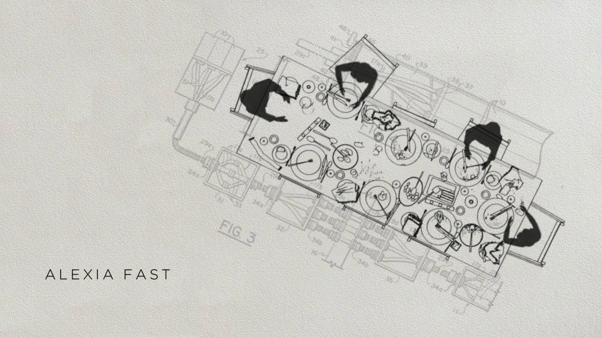
Planning and secrecy come to life in the diagrammatic titles developed for the WGN America wartime drama Manhattan, which draws a picture of daily life for the men and women involved in one of history’s most significant R&D projects. We brought new meaning to the term “nuclear family”
by cleverly juxtaposing the humdrum realities of suburban living with the theoretical physics and hard math that ushered in the Atomic Age. Match cuts turn the grim science behind the bomb's construction into innocuous objects and occasions—a frying egg and dinner time.

“This is the place,” the general declared. Los Alamos. A small, otherwise unremarkable town in the New Mexico desert hiding a big secret: the atomic bomb. Out of the wasteland, the people flocked, their families in tow. The best and brightest, the extraordinary and the ordinary, a critical mass of talent coming together for a terrible purpose. Soldiers, scientists, teachers, and engineers hide the truth of “the Project” from their loved ones.
The concept emerged from diagrammatically showing the juxtapositions between home and science in Los Alamos. Hundreds of the most brilliant scientists in the country and their families were all suddenly living together in a city built for this purpose. We kept on referring to this as a sort of colonization of Mars. In many ways, they were creating something out of nothing.

Original Styleframe

Reference

Original Design Board - Griffin Frazen

Reference

Reference

Original Styleframe
Original Styleframe
In the early design development phase, we discussed the idea of planning and the colossal amount of work that went into not only creating the atomic bomb but Los Alamos as a town itself. The town plan for Los Alamos inspired future suburban town plans that popped up nationwide, and many other patents were also created. While this happened, people were trying to live their lives — having dinner with their families, doing chores, and having get-togethers. There’s a certain irony these individuals experienced trying to live out their lives and simultaneously fervently trying to create one of the most potent weapons in the history of mankind.

The aftermath of the Trinity Test was the impetus for the final lock up. There is something so arresting about the burn marks in the arial photo. It draws you into explore it and to understand it. Just as it did for the scientists at Los Alamos. Like moths to the flame, the abyss that there is no return from.

Original Styleframe


